In the past few months, I’ve had some folks ask me how and why we came up with a new logo/brand for EdTOA. So, I wanted to take a quick minute to tell the story of where our new logo came from.
EdTOA represents an alliance of technologists. Our organization members have an incredible amount of talent and knowledge. Our mission – To foster efforts to identify, improve and support instruction resources within the SUNY structure – is no small task, and as instructional technology continues to evolve, the meaning of that mission will also evolve
Since I joined EdTOA in 2013 our organization webpage and our brand has remained mostly static. In the Fall of 2015 the Executive Committee set out to rebrand EdTOA with a new logo and a new website. Our goals were yet unknown but we were certain a new site needed additional functionality. I volunteered to lead this initiative because I have background in brand and website design.
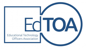
 I can’t say I am certain how it started. But I do know at some point I asked the question: Who designed our logo?
It wasn’t a criticism. The question was born out of my own love of typeface and logo design. I was curious as to where it came from and I wanted to find out if we could work on something new.
The answer was: It had always just kinda been there.
So, when the topic of a new website came up I jumped at the chance and added that I was interested in working on a new logo also. With that, our work was set out for us.
I began by looking at the current SUNY logo. I poured over the brand identity page for inspiration and an understanding of the genesis of the SUNY logo. http://www.suny.edu/brand/
![]()
I asked questions like: Why did they choose this logo? What does it convey and how does it scale? Is it dynamic and does it lend itself to all media?
With that in mind I set some basic rules for our new logo. It needed to be born from SUNY. After all, we are a SUNY organization. I also wanted it to follow the basic color scheme of SUNY. This would allow us to scale and set a shelf life for our own branding. As SUNY evolves so will our organization and as such our branding will evolve as well. And finally, I wanted to be sure our new brand looked cool. This is of course the most subjective of my criteria and I am far from a guy who knows cool, but I knew getting some quality designers on board would make that part easy.
Well, maybe it wasn’t as easy as I had thought. As I interviewed designers and began pouring through the initial submissions, there was certainly a lot of different ideas based on my design brief. To some, choosing a logo may seem as simple as picking a design. However, to have a lasting logo which stands the test of time it should have meaning behind it. Well, I think to give you an idea of some of the hundreds of designs submitted, here is a small sampling of some of the awful submissions we looked at.
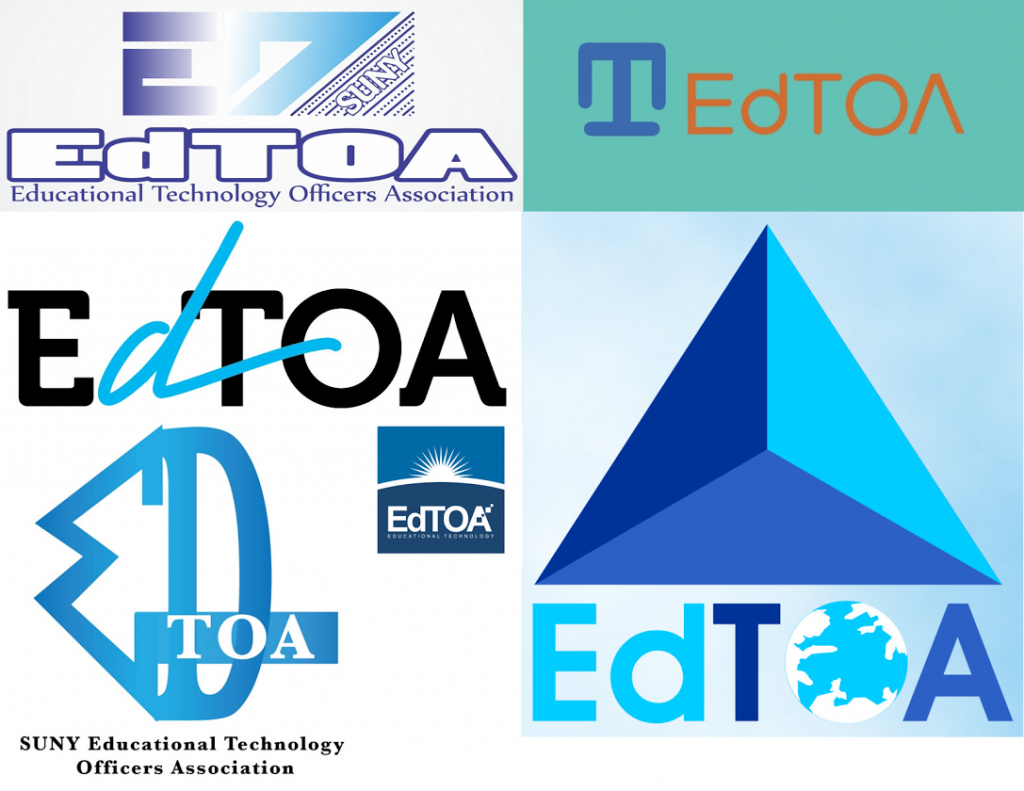
To be honest, as the first designs started coming in I was concerned. I worried I had made a mistake by not being specific enough on layout. But, as I spoke with the artists directly and shaped the work, I started to see something emerge which looked like the design I conceptually imagined but still needed someone to make a reality.
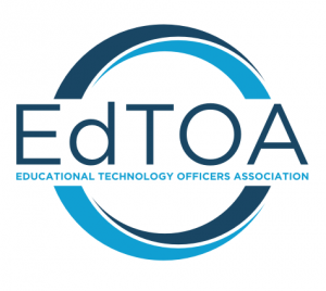
These first designs were good, but not quite there. So, I met again with with the designers and pushed a bit more for a – born out of SUNY – design. Then, our final design emerged.
The designer I worked with is named Marco Marsala. He lives and works as a graphic designer in Milan Italy. I spent some time interviewing him after his initial concept design and he showed an interest in the project almost immediately. My favorite quote of his is simply perfect in describing what we were after.
Communication through images is about finding the perfect balance between meaning and form. Is it a passion? Yes. Is it a mission? It is.
He was an absolute pleasure to work with and as he put the final touches on our new brand, I knew we had met my expectations and goals for rebranding. The first time I saw our near final design comp I knew it was the one. As I brought it up on the screen I actually said: “done“.
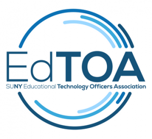
In order to refrain from my own bias, I setup an online poll where the executive team could vote on their favorite designs. After a few rounds of voting the choice was made. Out of nothing, we had selected the new brand of EdTOA.
I won’t claim to have done this on my own. The EdTOA executive team gave me encouragement and ideas along the way. Our discussions were fun and lively as we honed in on a final design. And finally, Marco was exceptional with his ability to take my words and find a way to turn that into art.
![]()
I don’t expect for this brand to last forever. As our organization moves forward and the mission and goals change, so will this. I am just very excited to be a part of an organization that works together and shares knowledge in an educational space where information, experience and talent are such an incredible asset. I hope in some small way this project has been able to contribute to that.
Fermin Romero III
6/8/2016